Greenbay platform

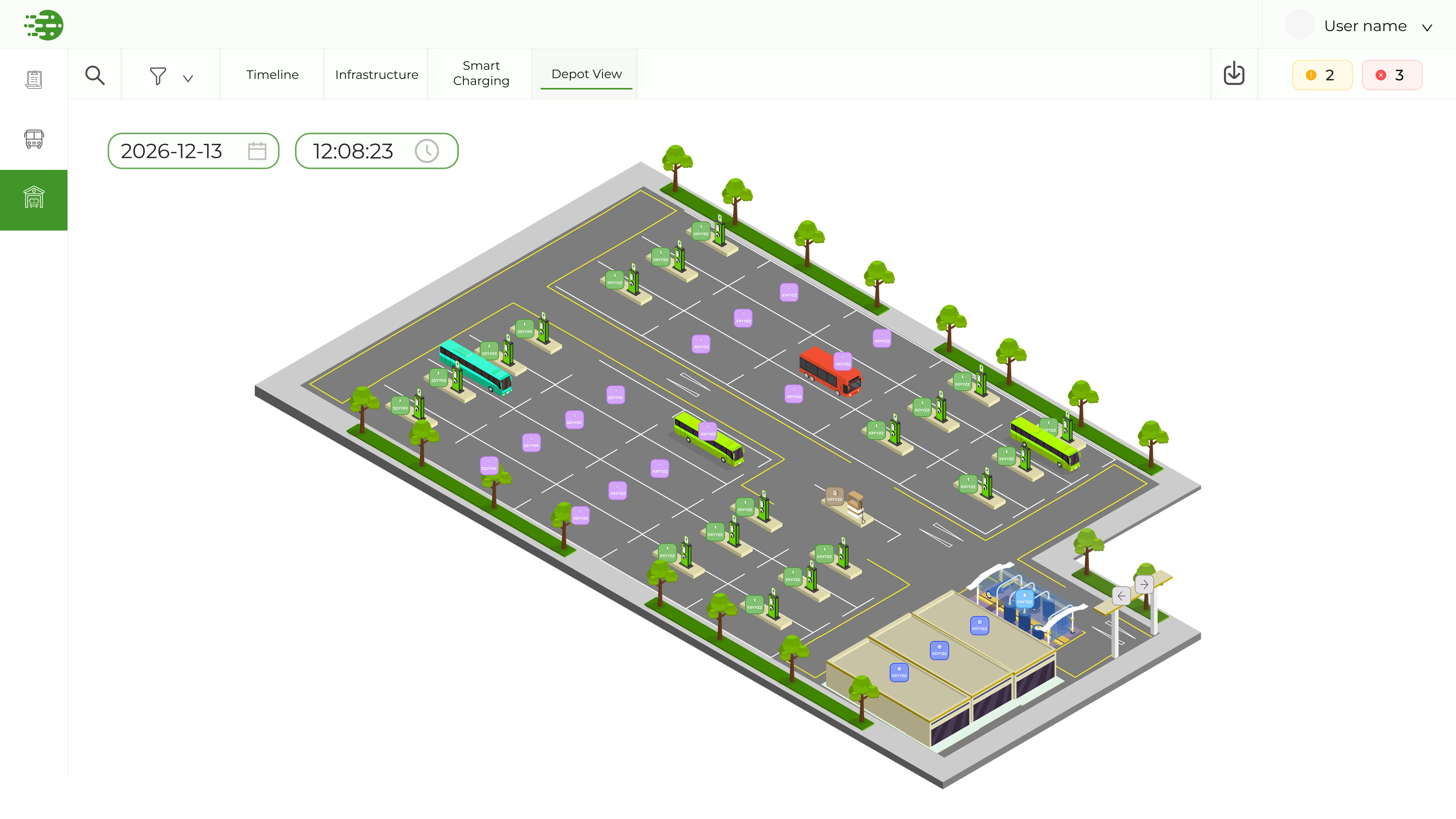
"GREENBAY is a modern AI-driven platform for mixed-fleet operations, connecting service planning with real-time depot execution."

Oren Arieli
Oren Arieli
CEO
Fleet illustration
About
/Overview

GREENBAY is an AI-driven platform for mixed-fleet depot management, helping transit operators coordinate electric buses, chargers, and maintenance from a single interface.

/Project
Project GREENBAY Solutions
Category Enterprise B2B SaaS
Focus AI Mobility / Fleet Ops
Execution Year 2025-2026
01 · Context

I joined as the only designer at an early stage, working directly with the CEO to design the product from scratch, owning everything from information architecture to individual component states.

Timeline · Hours Timeline · Days Infrastructure Smart Charging Depot View

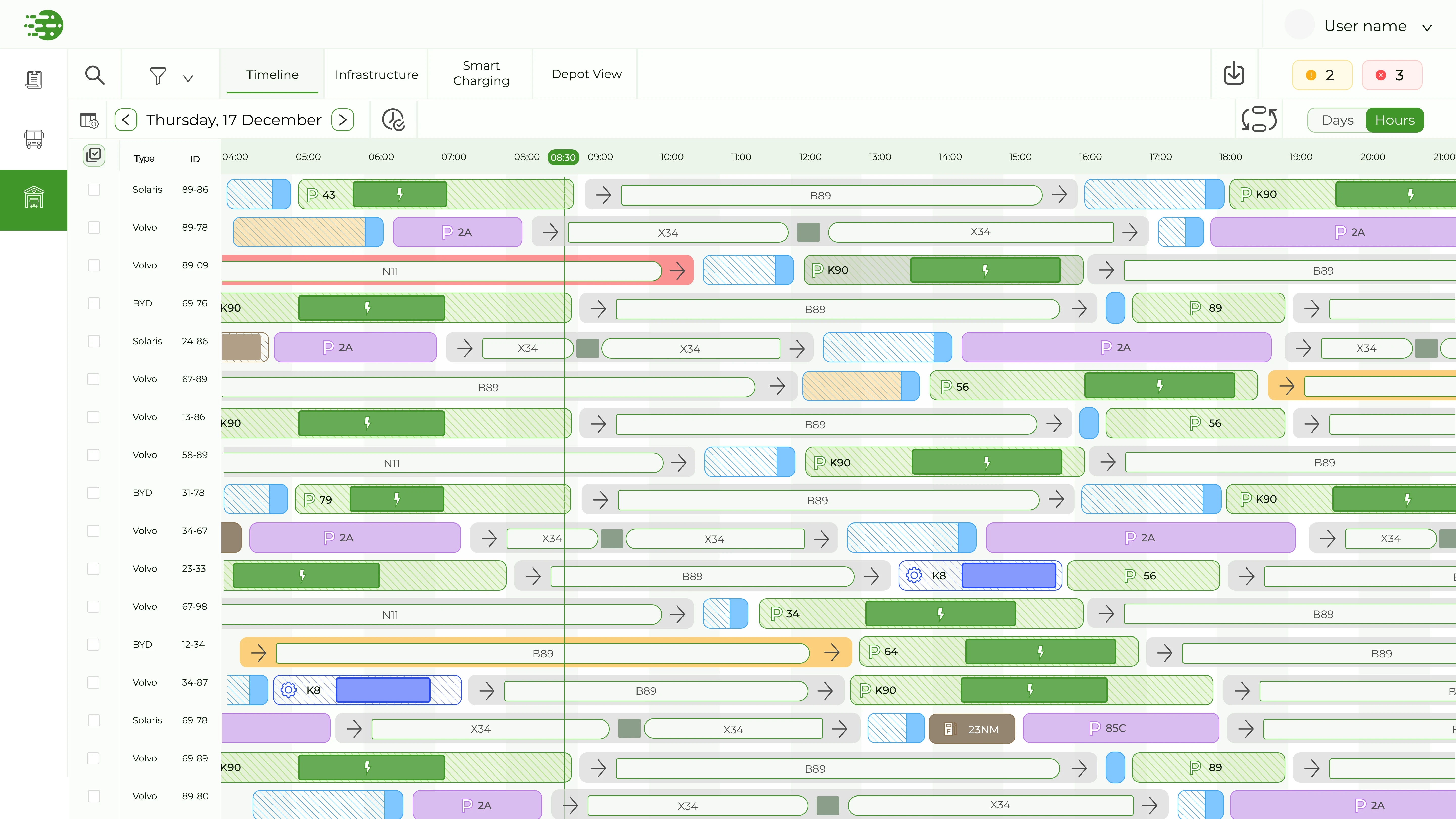
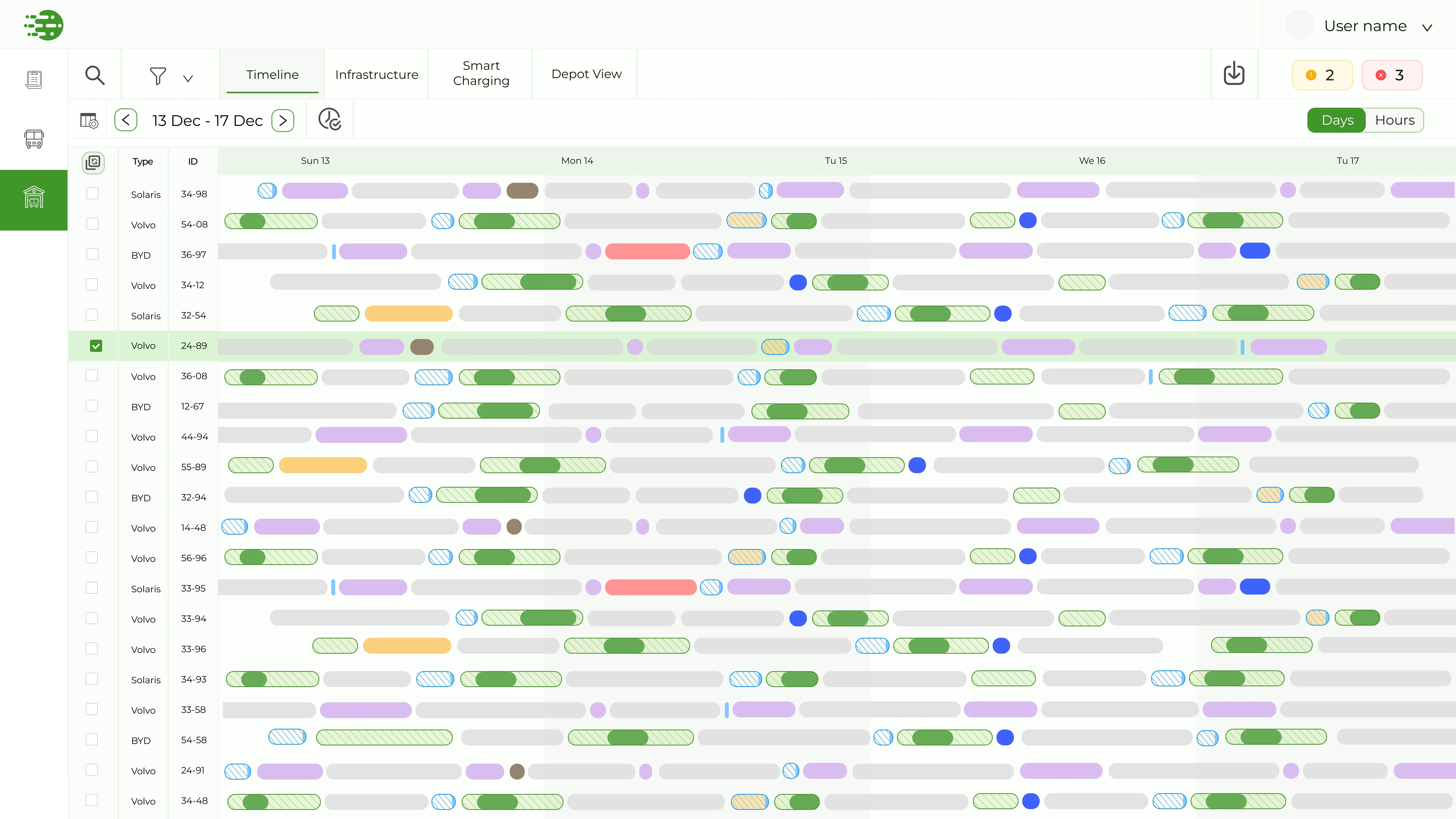
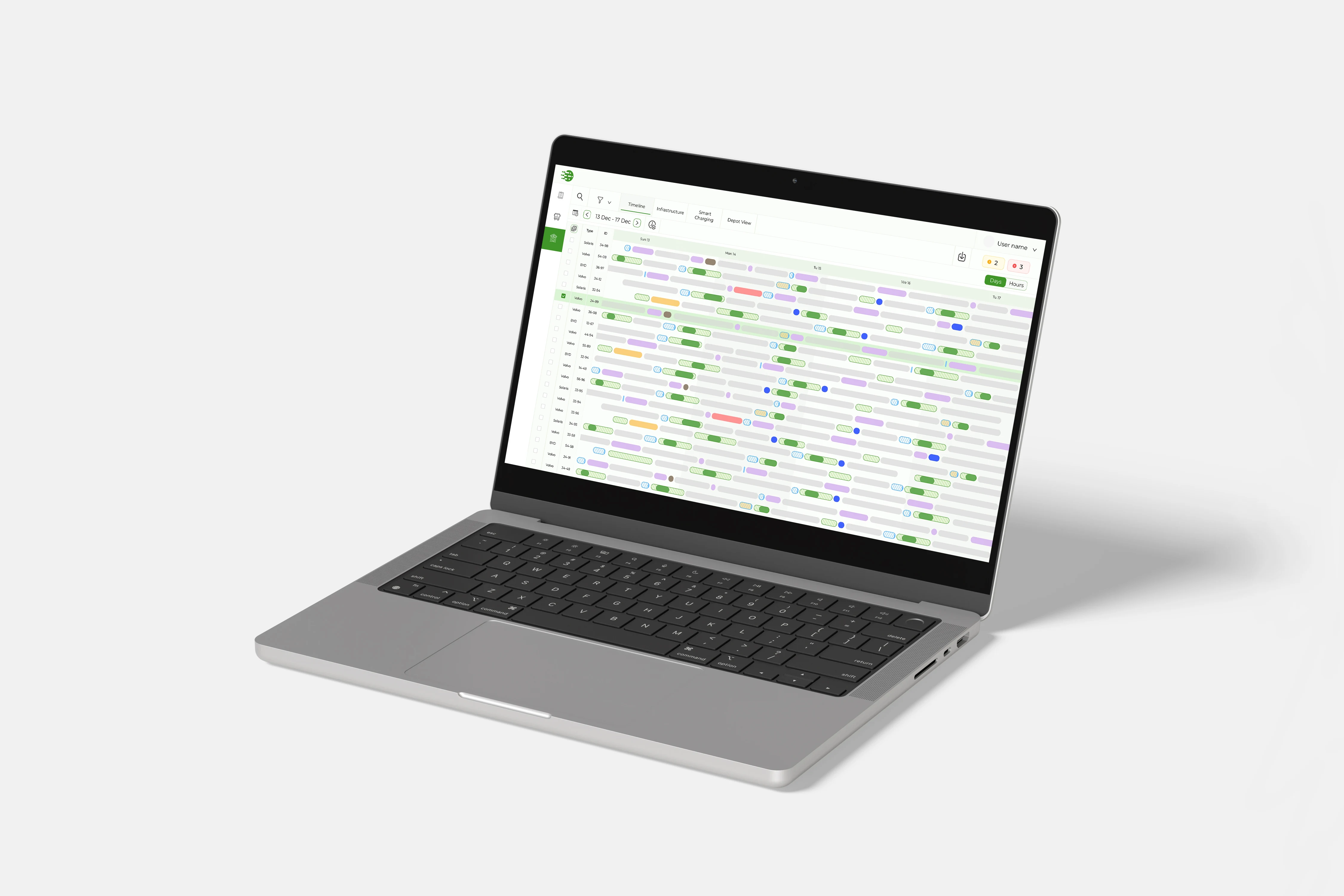
Timeline · Hours · per-vehicle scheduling across the day

02 · Why GREENBAY?

Electrification has broken traditional depot logic. GREENBAY connects high-level service plans with real-time execution, so operations stay on track.

The Problem
50% Higher Costs
Mixed-fleet operators face massive overhead when using legacy diesel tools to manage EV complexity.
Financial Penalties
Charger failures and battery constraints lead to cancelled trips and heavy contract penalties.
The Visibility Void
A critical gap exists between high-level service plans and real-time depot execution.
The Solution
AI-Driven Loops
A single platform that synchronizes real-time energy data with operational schedules.
Smart Allocation
Automatically assigns vehicles, chargers, and parking spots based on real-time constraints.
Continuous Adaptation
Instant re-planning based on Live SoC tracking, delays, or infrastructure health.
03 · Brand Beyond the Product

Carrying the System Outward

The design system extended past the dashboard.

I led GREENBAY's full visual language, from the logo and color system to the materials used in sales conversations: the website, business cards for the founding team, and one-pagers used in client meetings.

GREENBAY mobile app, operator task confirmation
GREENBAY color palette
GREENBAY welcome screen on laptop
GREENBAY marketing website
GREENBAY business card mockup
GREENBAY sales one-pagers

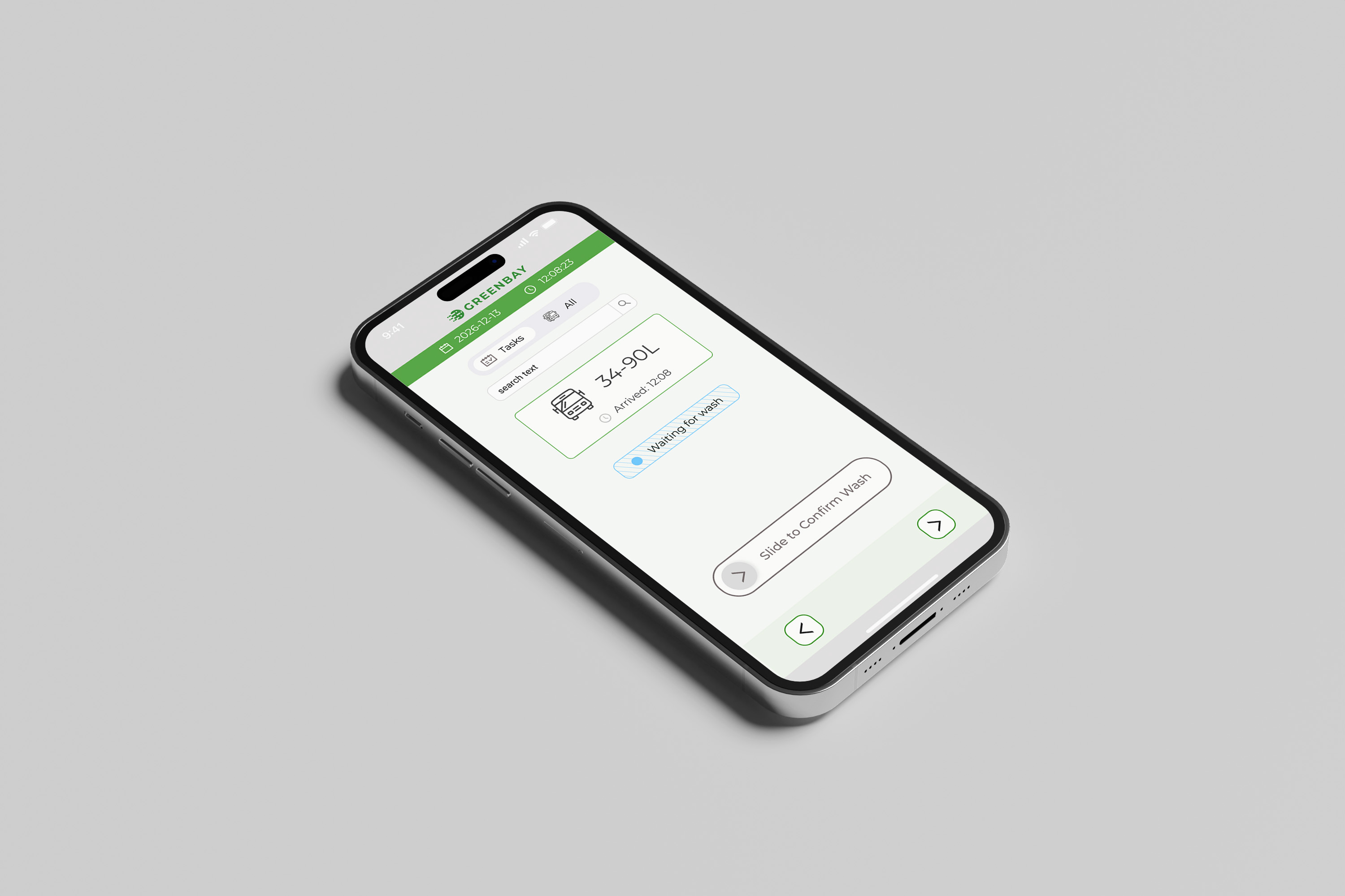
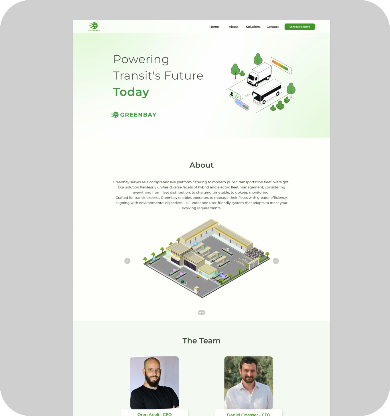
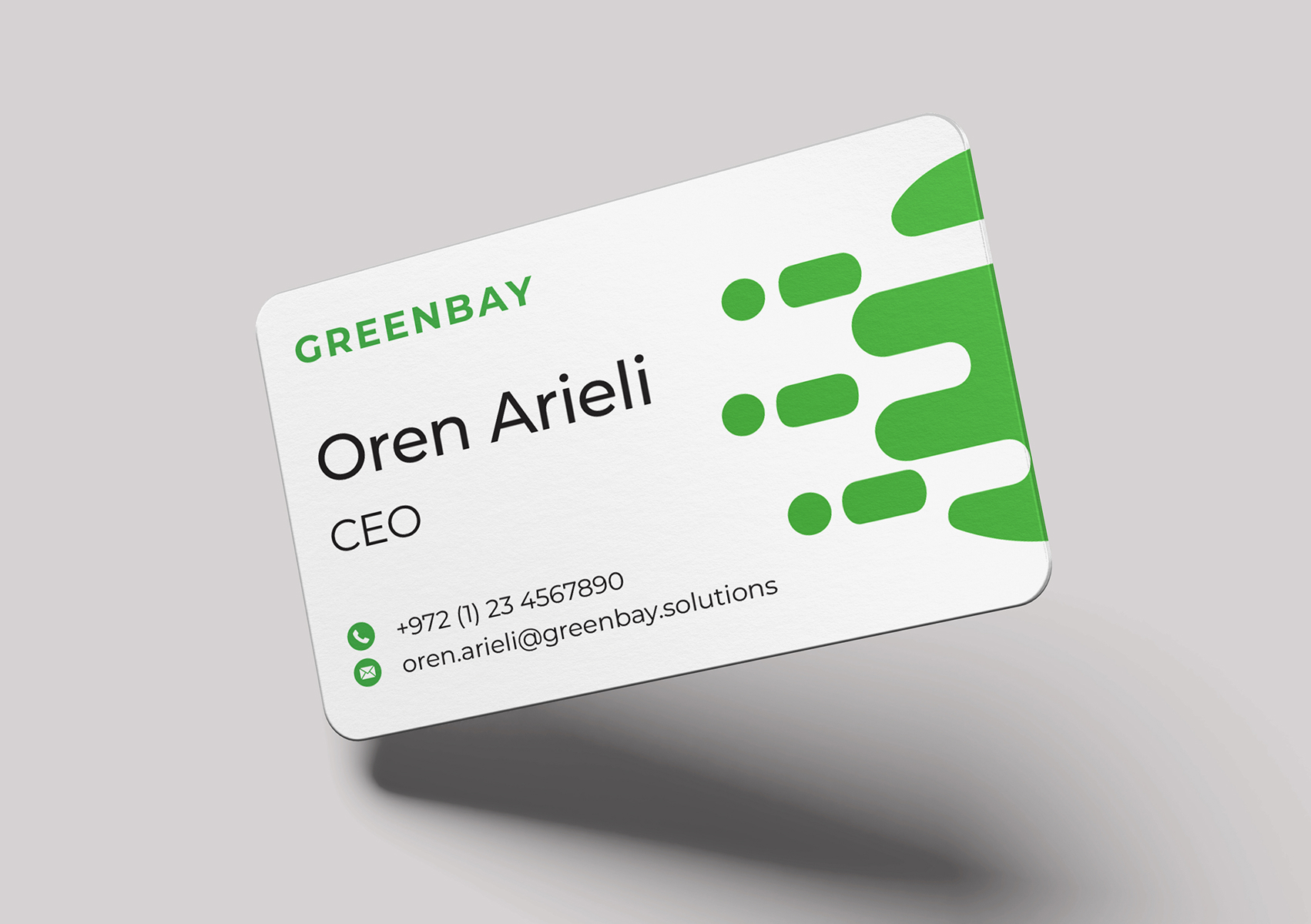
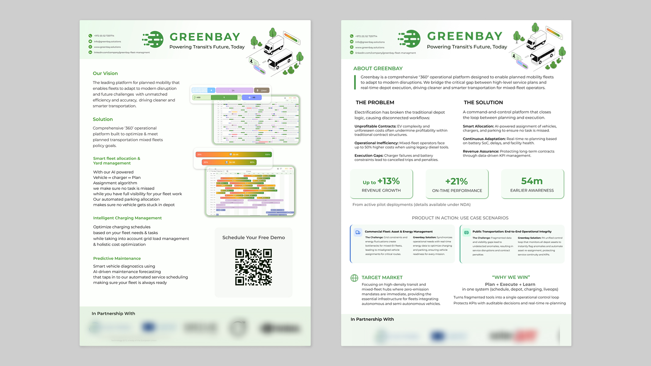
Logo · Color system · Mobile · Website · Business cards · Sales one-pagers

04 · Sidebar redesign

Optimizing for Operational Speed

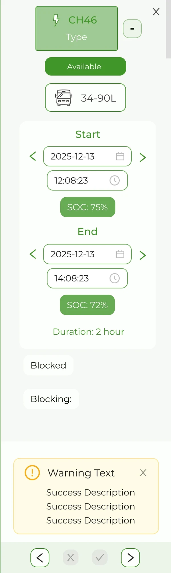
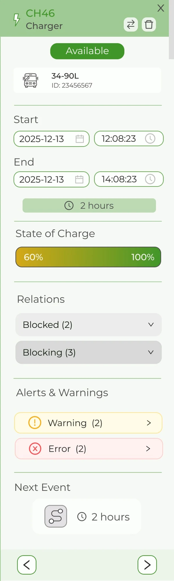
The sidebar is the primary interaction point within the Operational Timeline.

The sidebar is the primary interaction point on the Operational Timeline, where managers make real-time adjustments to keep the fleet on schedule. After the pilot, V1 carried too much cognitive load. Raw data without hierarchy made fast decisions hard under pressure.

The redesign was guided by three principles: Show, don't tell (progress bars instead of SoC numbers), Make absence meaningful (visible counts for blocked events), and Severity hierarchy (warnings clearly separated from errors).

What changed
Visual SoC
Static numbers → visual progress bars
Dependencies
Hidden labels → expandable counts
Hierarchy
Priority-based Warning/Error cards
Next Event
Proactive turnaround context
Before
Old sidebar
Manual Logic - State of Charge (SoC) shown as percentages, requiring managers to perform "mental math" to estimate range.
Input Clutter - Redundant navigation arrows on date/time fields created visual noise without adding functional value.
Ambiguity - Undifferentiated alerts made it difficult to distinguish between minor warnings and service-breaking errors.
After
New sidebar
Instant Readability - SoC visualized as a progress bar (60% → 100%) for zero-effort comprehension of vehicle readiness.
Zero Visual Noise - Simplified date and time inputs designed for fast editing, removing unnecessary navigation iconography.
Severity Hierarchy - Clear separation between Warnings and Errors, ensuring critical operational issues are addressed first.
Predictive Context - Added a "Next Event" slot to help operators proactively plan the vehicle's turnaround after the current mission.
05 · Results

Measurable Operational Growth

Moving from manual monitoring to an AI-driven dashboard led to clear efficiency gains across pilot depots. Putting speed of comprehension first in the UI helped operators keep service running and avoid lost revenue in real time.

+21%
On-time performance
Reduction in missed or delayed trips by closing the gap between planning and depot execution.
+13%
Revenue growth
Protected long-term contracts through better automated KPI management and penalty avoidance.
54m
Earlier awareness
Average time gained on detecting operational issues, shifting from reactive to proactive management.
06 · Key Takeaways
Efficiency Over Aesthetics

In operations, speed of comprehension is the metric. Clarity isn't a design choice; it's a safety requirement.

Designing For Uncertainty

Missing data isn't a zero: it's a risk. "Unknown" states must be designed as rigorously as active ones.

Ownership & Speed

As a sole designer, working directly with the CEO taught me to align visual logic with business KPIs.

Iterate, Then Refine

The Sidebar V1 was built for speed; V2 was built for the user. Acknowledge tech debt, then solve it.

Next project Sugar & Spice